
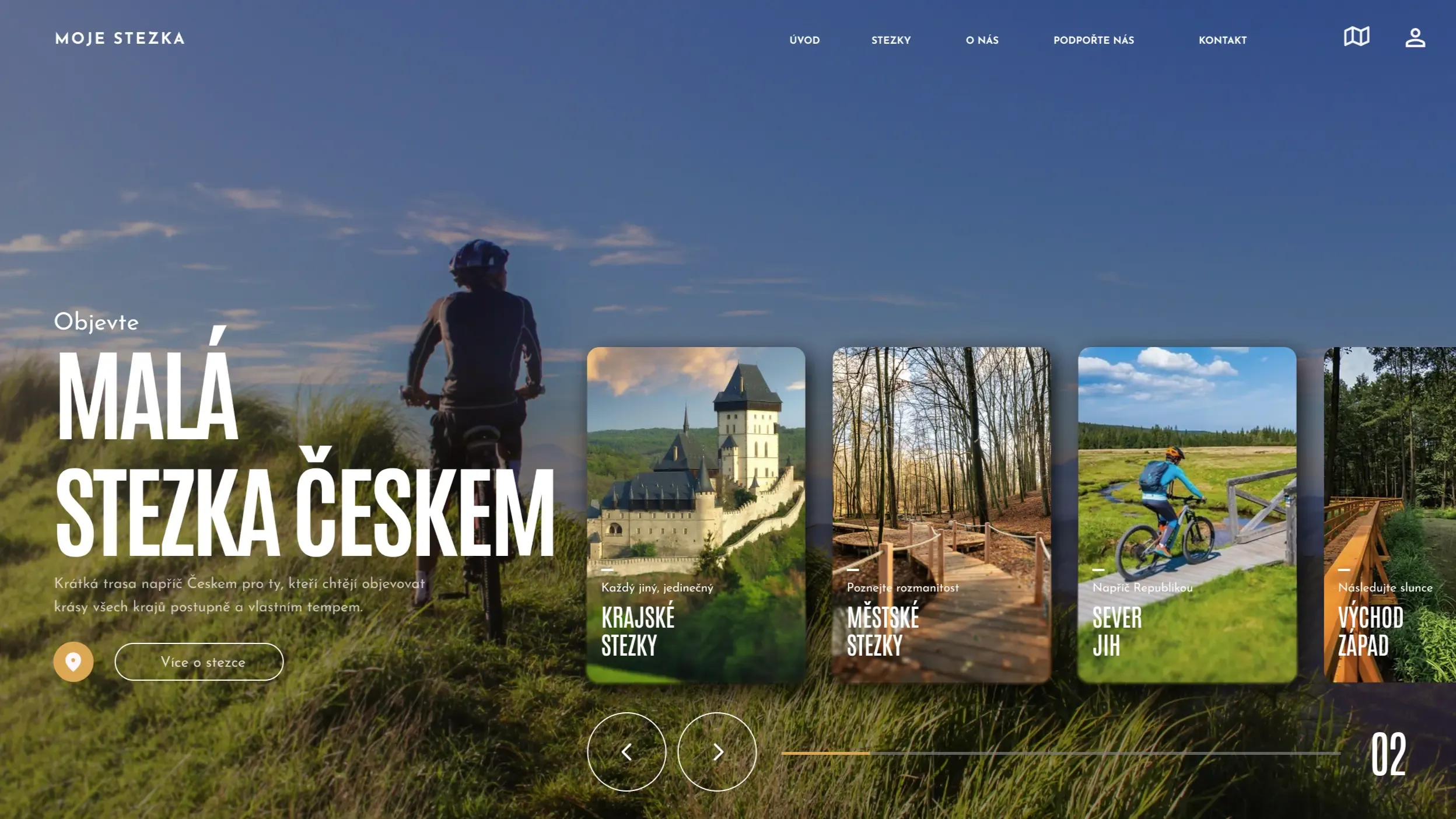
When designing a tourist or cycling website, the biggest challenge is simplicity. Users don’t want to study a manual. They want to quickly understand where they are going, how difficult the route is, and whether they can handle it. This was precisely the fundamental principle behind the design of the trail-focused website.
Content Segmentation by User Type
Right from the start, we addressed the fact that cyclists and hikers think differently. Therefore, it makes sense to segment content right at the first level of the website. Users should not have to click through anything that does not concern them.
Route as the Main Element of the Website
The route detail is not just another subpage; it is the core of the entire website. Each route must have:
- clear length and elevation
- time difficulty
- information on who it is suitable for
- elevation profile and map
Minimalism Instead of Overload
With similar websites, a common mistake is the attempt to display everything at once. We take the opposite approach. We want to show only what the user genuinely needs at that moment.
Future Preparedness
When designing the structure, we already account for the fact that the website will grow: new trails, stages, language versions, or additional services. The foundation must be solid, yet flexible.
Conclusion
A good tourist website guides users naturally. They do not think about controlling it, but about where they are heading. And that is precisely the aim of the design.